10
Sep 2018
Playing with the shades
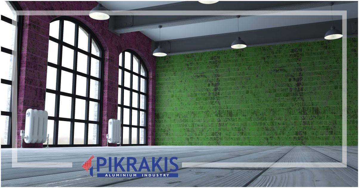
Colour of frames and its combination with masonry.
We do understand the power, the sensation, and finally the result that a colour creates, only when it correlates with the other colours of a space. So the right combination of colours is very important. What we are looking for through the colour combinations is a balanced result that reflects our personality and style.
What colour of aluminum do I put? Do I choose the same colour for window frames, railing and the pergola?
Keep in mind, the rest of the materials you have used, such as stone, brick, wood. In a place where you spend many hours, we suggest soft tones.
Certainly, earthly tones are a safe and timeless choice. Fortunately, with the effects and the special texture, they become unique in character, remaining easy to combine and versatile!
Blue shades in designated areas such as seaside or islands, such as Santorini, are ideal and often required.
Green shades are considered as ideal in countryside, with a strong tendency for olive green.
Charcoal shades are more than a simple trend in architecture. It is often a safe choice in professional settings (e.g. catering and medical practices), while it goes up to the dwellings as well!
Using the colour circle, you can see how colours match each other and can give you a wide variety of combinations in your space.
For more help with paints, click HERE