12
Sep 2018
The science of colour
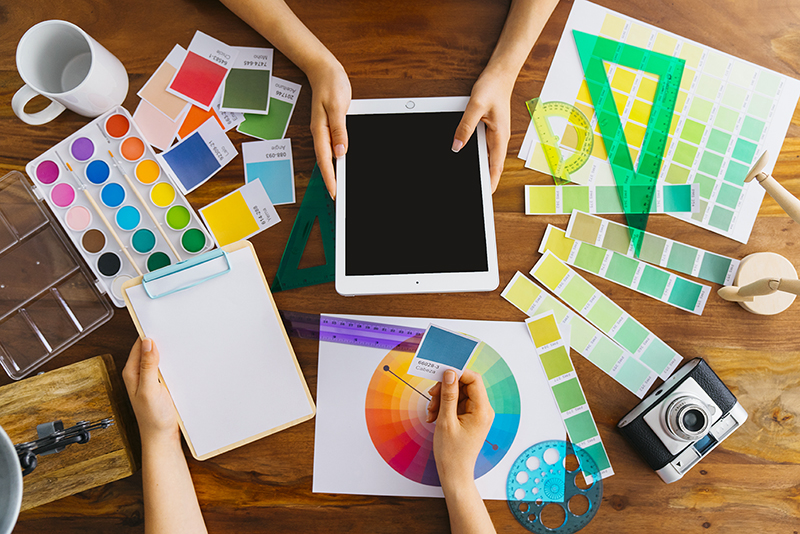
We perceive the power, the sensation, and finally the result that a colour creates, only when it correlates with the other colours of a space. So the right combination of colours is very important. What we are looking for through the colour combinations is a balanced result that reflects our personality and style.
Using the colour circle, you can see how colours match each other and can give a wide variety of combinations in your space
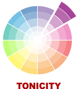
Playing with the Shades
The choice of shades (tones) of the same colour is the simplest combination we can make, to give our space a warm and calm atmosphere.
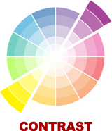
Creating Contrasts
For a striking effect, we choose, from the colour circle, a colour which is contrasting to the basic colour we have chosen, for example, purple with yellow, blue with orange or red with green.
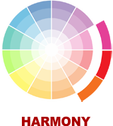
Seeking Harmony
Combining adjoining colours to the colour cycle, we can give our space a beautifully balanced and pleasant result, e.g. red with purple or red with orange.
Our new colours were released in February 2018 and follow the new architectural trends as well as the requirements of the modern and traditional buildings.
The collection of gp colours are super-resistant, they are a result of a careful study of the architectural trends of our country for professional spaces and residences.
The collection of wood colours is specially studied and super-resistant to the climatic requirements of our country!